
A post about Autodata came across my feed on X last week, a new system out of Meta’s FAIR where a language model writes and grades its own training data, works out where it falls short, and rewrites its own recipe to do better. It is a genuinely interesting idea, and there was a lot of excitement around it.
The reason it caught me is that generating data to train models is a problem I have been living in pretty heavily myself. Just not in language.
Since leaving Automattic to start something new, I’ve been focused a lot on numbers. Time series, the measured behavior of physical systems: a grid’s load and price, a factory line’s sensors, the ticks of a market.
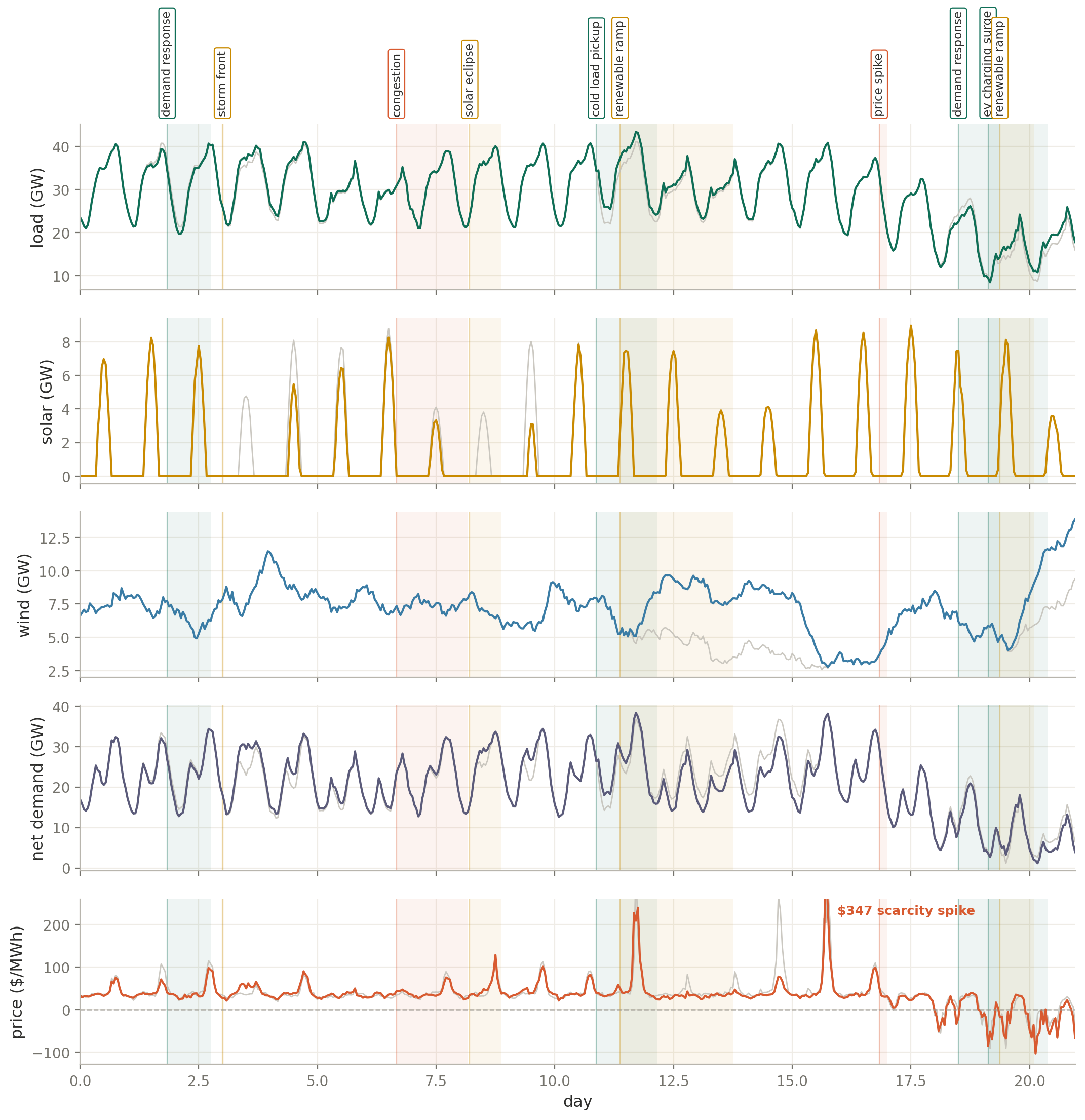
Basically, the past weeks have been spent staring at stuff like this.
And because I’m so deep in this and this data generation topic is timely, I figured I’d do a write-up here – about how we’re generating synthetic data for numbers, time series, forecasting and decisioning.
To me that is the more interesting problem, because numbers are the language of the world rather than the language of the humans inside it. A sentence is something a person made up (though there’s a lot of interesting thinking about language + the world, don’t get me wrong). A load curve is the world actually doing something.
That is the bet the lab I’ve co-founded is built on (more on this soon). If you want models that are genuinely intelligent about the physical world, the kind that can control a system, a machine, or the operators working inside it, you have to train them on that language directly.
And to make those models good you have to scale them, and to scale them you need far more of that world than has ever been recorded, which means you generate it.
So Autodata and I are reaching for the same lever from opposite ends. What I have learned is that the synthetic data question looks pretty different once the data is numbers instead of words, and that difference is what this post is about.
The Rare Cases Are The Whole Point
The right call in one of these systems almost always depends on whether the model has ever watched it behave the way it is behaving right now. So the model has to have seen the world, and in particular it has to have seen the parts of the world that go wrong.
That makes the rare moments the whole game: the heat wave that breaks the load curve, the outage that cascades through a network, the week a market does something it has not done in a decade. Those are exactly the moments a model is least likely to have seen, and they are where decisions are won and lost.


Real data is thinnest in precisely those places. The historical record is full of ordinary days and almost empty of catastrophes, which is backwards from what you want when the entire point is to prepare a model for the catastrophe.
So you manufacture the rare material yourself, carefully and in volume. None of this is a hot take. Many of the leading time series foundation models already train partly on synthetic data, with Chronos mixing real series and machine-generated curves to improve how it generalizes, even as others like TimesFM pretrain mostly on real-world data.
The field is clearly moving toward synthetic data as a core ingredient rather than a curiosity. The question was never whether to generate data. It was how to generate data worth training on.
Starting From TimeCraft
A while back I opened a pull request against Microsoft’s TimeCraft. It’s a synthetic data generation library, and I was interested in using an SSM to approach the problem of this type of data generation. It is a thoughtful piece of work in its own right: you can steer the generation with text, point it at the model you eventually want to train, and its related work feeds the results into foundation-model pretraining.
Working with it clarified the distinction I actually cared about. Being able to steer generation with text is not the same thing as building series where events ripple through a (somewhat) physically coupled system, which is what the decision tails are made of.
Most synthetic data, that kind of steering included, still amounts to a smooth, seasonal curve with some noise on top. It is good at teaching a model what normal looks like, and it says very little about what knocks a system off normal, which is the only place a decision ever actually gets made.
Make The Event The Unit
So we built the entire generator around the event as the central object rather than an afterthought.
The recipe is refreshingly simple. You start with a baseline, which is the boring part, because any standard background process gives you a plausible load curve or random walk. You stamp a sparse set of events on top of it, and you add a bit of realistic noise.

That picture is the whole model in one breath: the boring baseline, the events that actually carry the information, and the noise that keeps it believable.
The events come from a small vocabulary of shapes. A spike with a slow fade, a ramp that holds and releases, a sudden step, a dip that recovers, a slow drift into a cliff. Each one is really just a handful of dials for how fast it arrives, how long it lasts, how quickly it decays, and how big it gets.
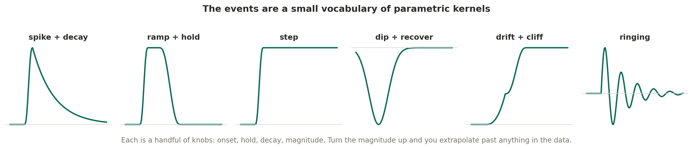
That last detail matters far more than it looks. An event is not stored data, it is a small handful of numbers you set, which means it extrapolates cleanly, at least up to a point.
A heat wave worse than any on record is, to first order, just a bigger number on the same shape, and that shape stays believable out in territory where a model trained only on history would have nothing left to copy from.
The real caveat is that this only holds while the shape is wrapped in the system’s real limits. A grid eventually runs into hard ceilings, generators that can only push so hard, transmission that can only carry so much, and prices that are capped by rule, so the clean extrapolation is only ever as good as the limits you wrap around it.
The second half of the bet is coupling, and this is where the most important design decision lives: you derive rather than bolt on.
An event is never a bump on one isolated line. It is a shove that moves a whole correlated set of signals at once, and the tempting but wrong way to capture that is to hand-paint a matching wiggle onto each channel.
The right way is to push on the physical layer and let everything else fall out of the mechanism. In a grid, the event lifts load and cuts solar, the net demand follows by simple arithmetic of load minus wind minus solar, and price comes out of a simplified stand-in for how a market sets the price where supply meets demand, rather than being painted on directly.
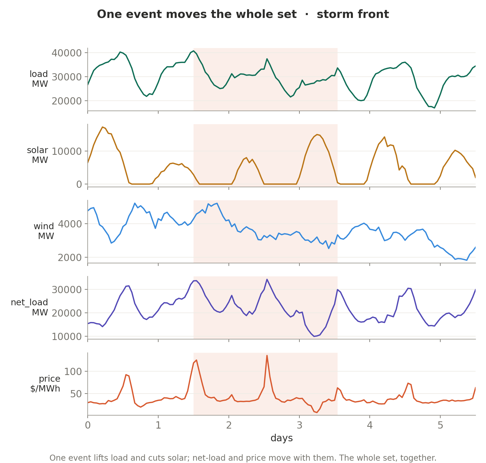
It is not the full machinery a grid operator runs, with every bid and transmission constraint and scarcity premium. Even so, the stand-in produces the behavior that matters: price climbs as net demand approaches the available supply, and it turns negative when renewables flood a sleepy grid.
You get the duck curve, the famous midday sag that rooftop solar carved into net demand, and the negative prices, because the mechanism genuinely produces them rather than because I drew them in.
Every Channel Has To Obey A Law
Getting the structure right is the expensive part, and my first attempts were wrong in ways that were easy to miss. The extra channels looked fine and were not.
I had occupancy creeping over a hundred percent, response time that rose in a perfectly straight line, and a price that had effectively been painted on after the fact. The fix in every case was to make the channel obey its actual governing law instead of a convenient approximation of it.
A queue’s delay follows a simple law from queueing theory: it stays almost flat while there is slack and then shoots up as the line approaches full. Traffic speed follows the road’s fundamental diagram, holding near the limit until the road passes a critical density and collapses into a jam. Inventory is a running balance, yesterday’s stock minus what sold plus what was restocked, which traces a sawtooth rather than drifting smoothly.
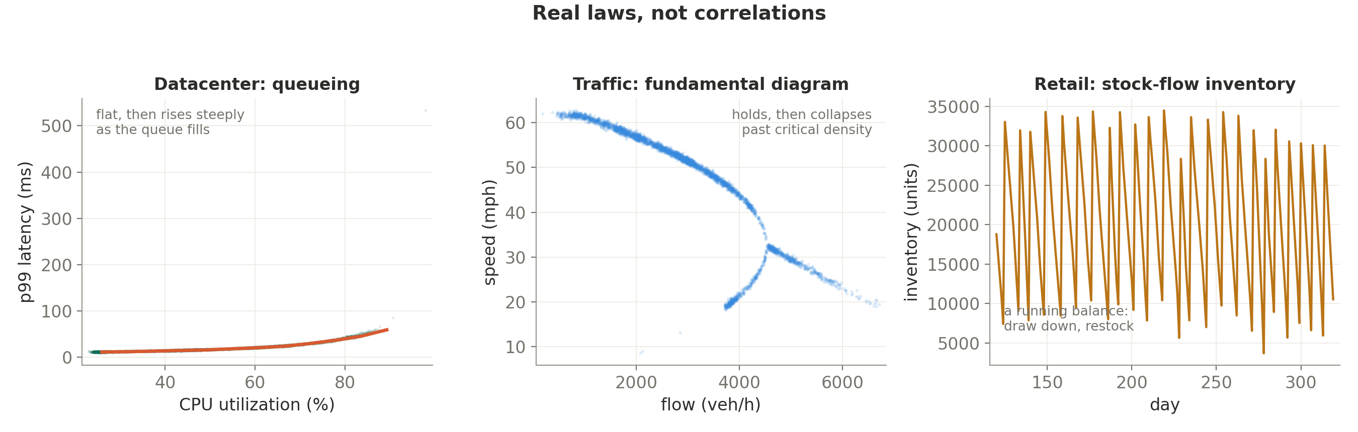
None of those shapes can be faked with a correlation. They come from the actual equation, which is also why they stay believable at the extremes.
The same machine runs across every domain we care about, and each channel keeps its own law.

Two traps in here cost me real time, and both are worth passing along.
The first is that clamping a bad parameter does not fix it, it merely hides it. When I capped occupancy at a hundred percent, the violations disappeared, and the channel then sat pinned at exactly a hundred for half the series, which is its own kind of fake.
The real fix was to size the response properly and let it level off smoothly, so the channel lives in a realistic band and only touches the ceiling during a genuine event.
The second is subtler, and I would warn anyone building this to watch for it: permanent events pile up. A step change or a permanent shift lasts to the end of the series by definition, so if you scatter enough of them across a long stretch of time, they add up into a one-way drift.
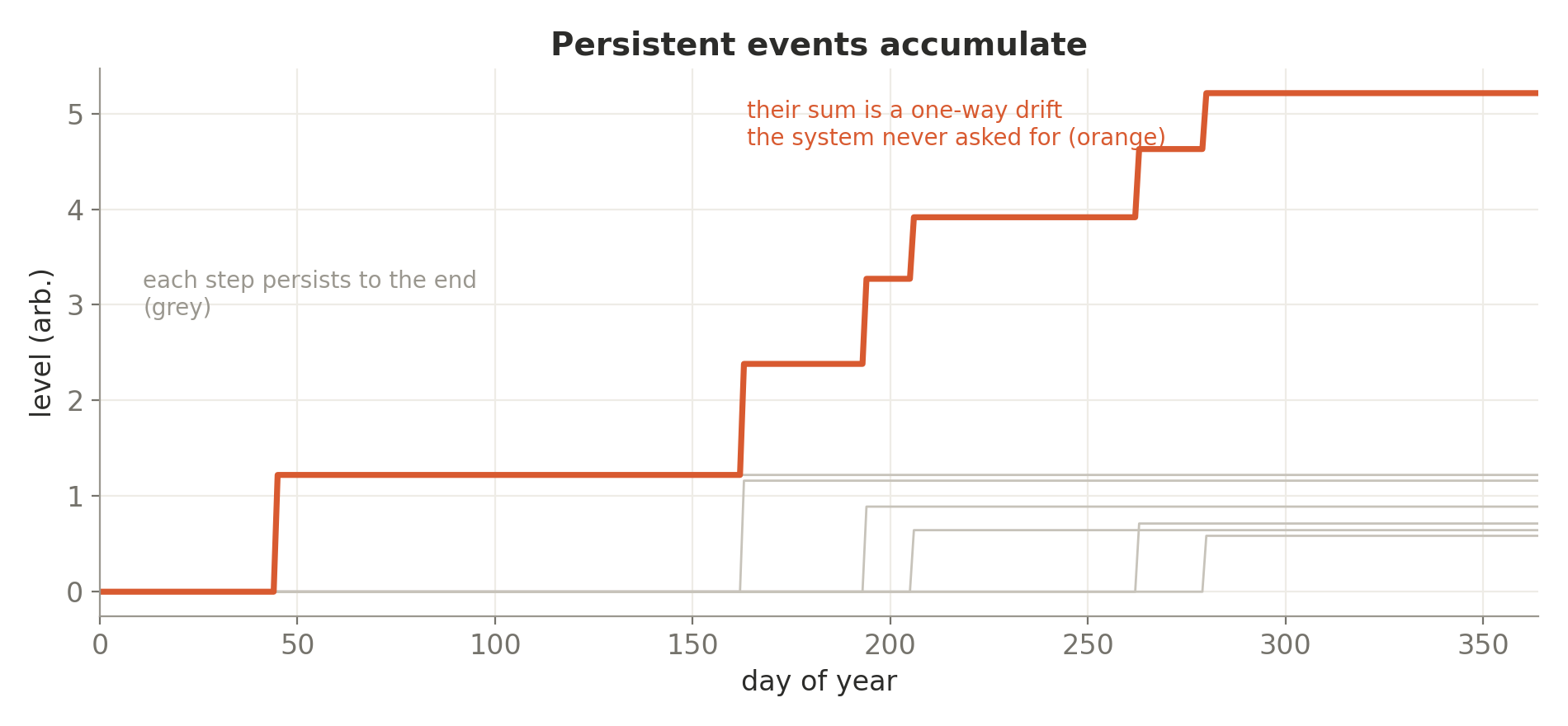
At one point my grid load was growing something like ninety percent a year for no reason at all, because every step from January was still adding its offset in December. The fix was to make permanent events much rarer, so the temporary ones dominate and the normal yearly rhythm survives.
It is exactly the kind of failure that stays invisible until you go looking for it.
This Is Not Just Energy
None of this is specific to energy. The same event-and-coupling machine renders a jet engine wearing toward a failure, which is every bit as much a decision problem as a grid is.
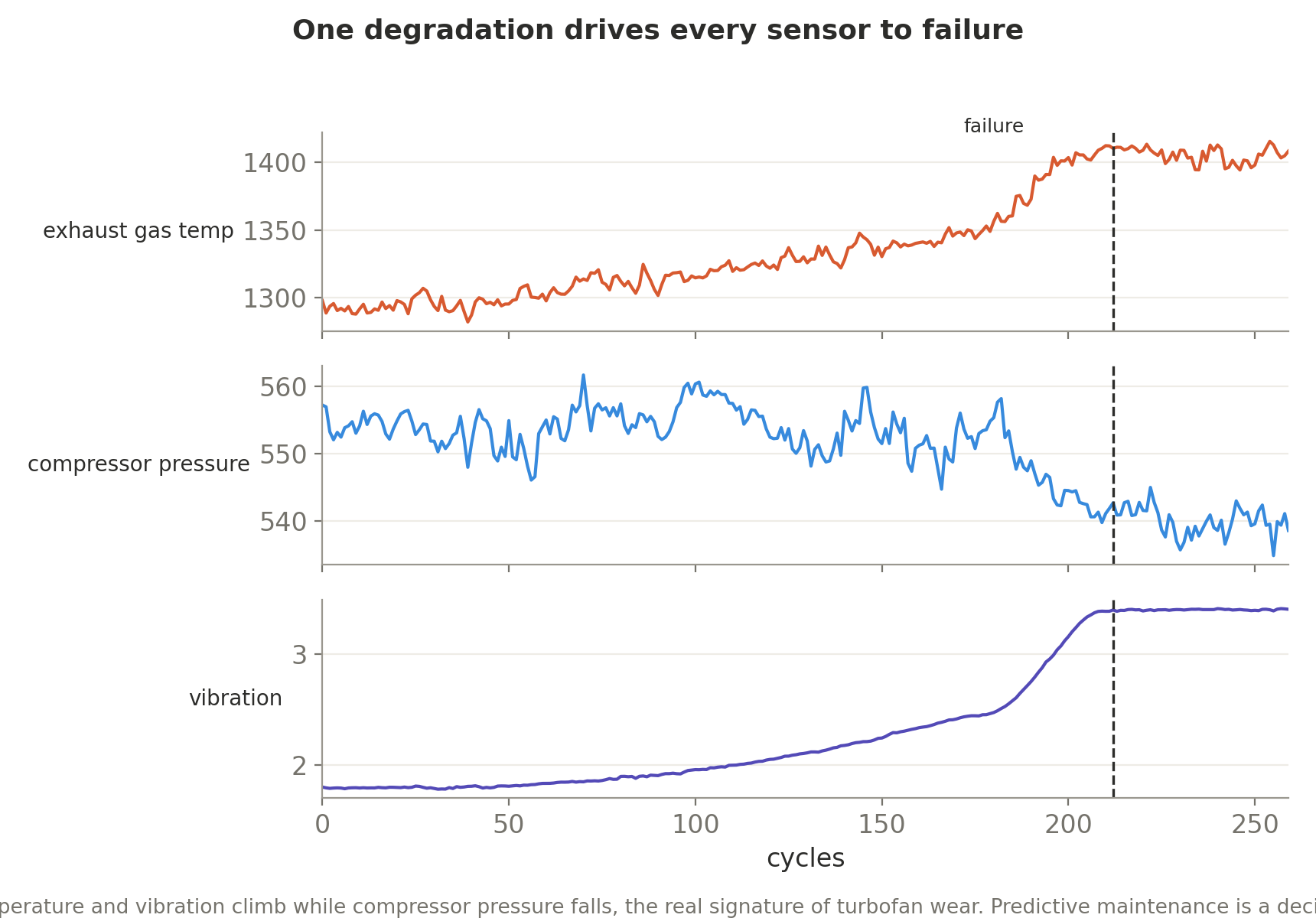
A single slow degradation drives every sensor at once, with the right fingerprint: exhaust temperature and vibration climbing while compressor pressure falls.
Catch that curve early and you have made a maintenance decision worth real money, which is the entire reason to generate the data in the first place.
Looking Real Is Not The Goal
We eventually got it to the point where a working energy trader looked at a sample and believed it. That felt like crossing the finish line, right up until I realized it was not one.
Looking real and being useful to train on are genuinely different properties, and you can nail the first while completely missing the second. A series can pass every eye in the room and still teach a model nothing it did not already know.
Realism is the entry gate, not the prize, which is exactly why none of what I have described so far is the real test. The real test is downstream.
Put An Adversary On The Data
The most valuable contributor on the entire project was an adversary whose only job was to try to prove the data was fake. We distilled a lot of the conversations that we had had with folks in energy into an LLM as a judge or what we call an adversary. “Red team this data.” Within a few minutes it found a sign error that every automated test had happily waved through.
The mechanics are worth knowing, because they are easy to repeat. Some of my event shapes are naturally negative, since a dip-and-recover bottoms out below zero, and the physical effect carries its own sign too.
So when a solar eclipse correctly gets a negative effect in order to reduce solar, you end up flipping a negative shape by a negative sign and flipping it twice. The eclipse was adding nine gigawatts of solar in the middle of the night.
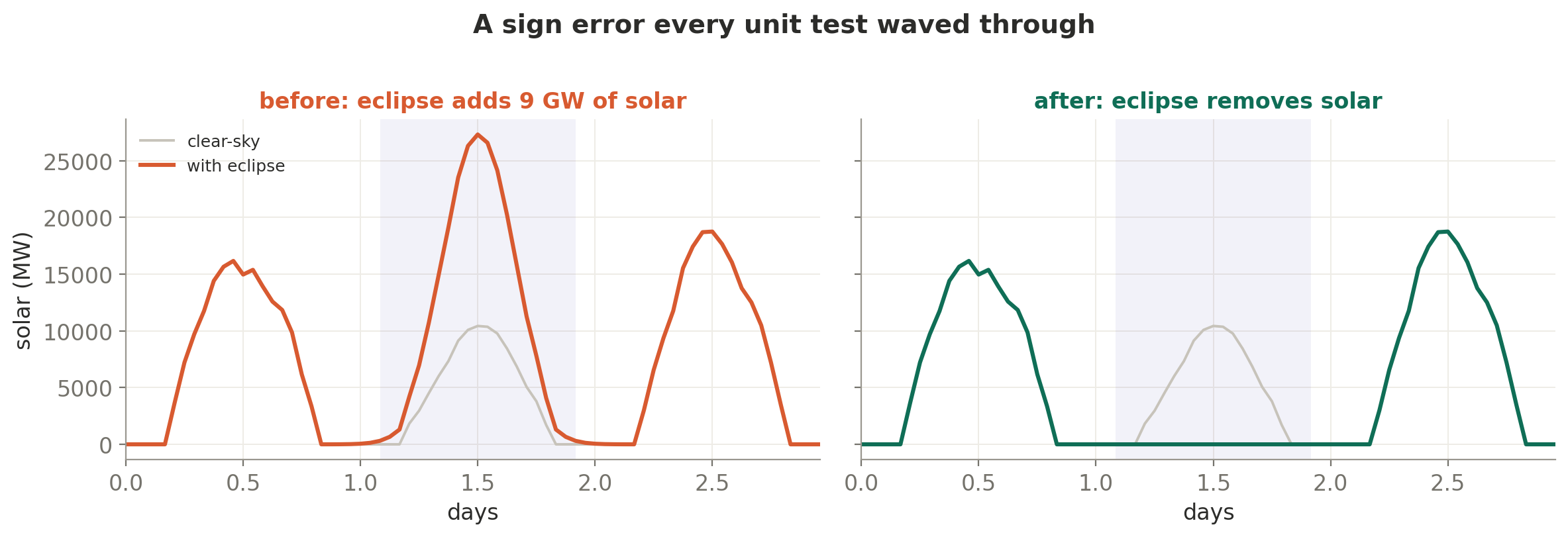
Every test stayed green, because the tests were checking the shape and the size rather than the direction across the whole catalog. The fix was to make each shape strictly positive and let the sign be set in exactly one place.
Tests check what you thought to ask. A skeptic checks what you did not.
Get The Noise Right
A couple more surprised me, and both are about getting the random part right rather than the structure.
The first is that rare extremes do not survive smoothing. Real load has genuinely fat tails, the occasional weather-driven extreme far outside the normal range, so I added a heavy-tailed ingredient to the noise and then watched the tail-heaviness barely budge.
The reason is that I had built it as a smoothed noise process fed by big random shocks, but smoothing is a kind of averaging, and averaging pulls those extremes right back toward an ordinary bell curve. You cannot smooth your way to a fat tail.
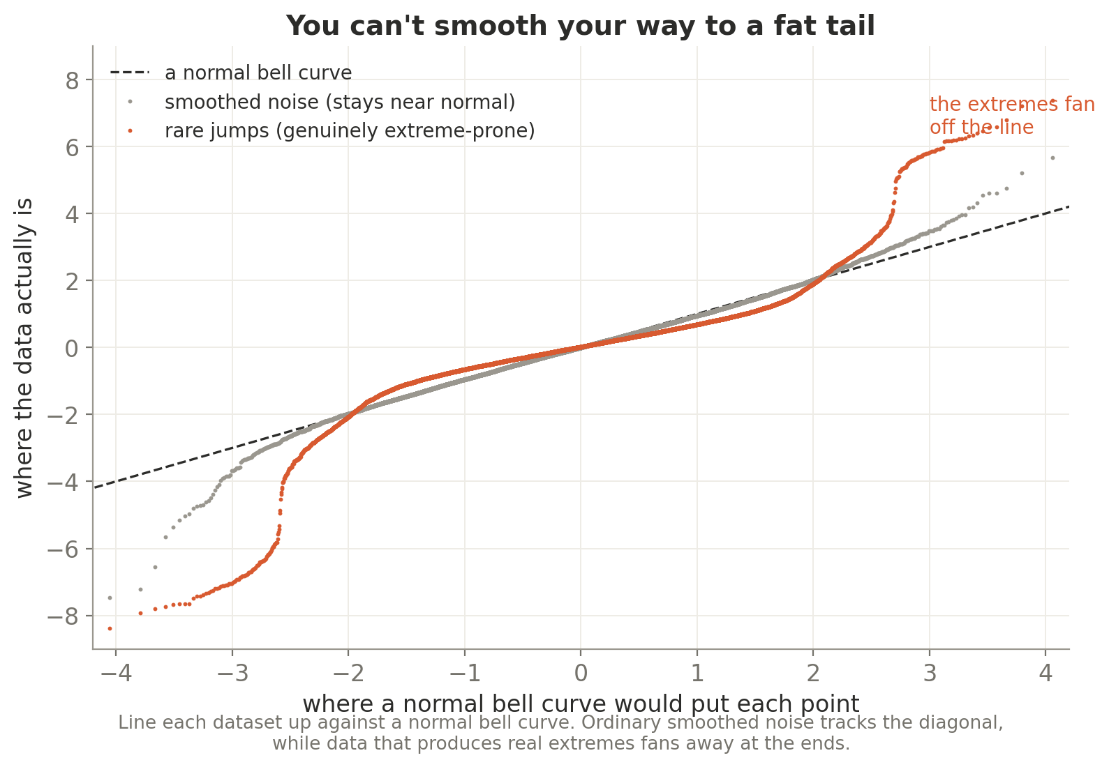
What actually worked was injecting the extremes as rare, sustained events, the occasional multi-day anomaly with an outsized magnitude. Jumps, rather than smoothed noise.
The second is that the channels have to be consistent with each other or you get caught. I had a finance system whose volatility channel clustered beautifully, with calm stretches and stormy stretches in just the pattern real markets show.
Except the price series it was supposedly describing was a plain random walk whose moves were the same size all the way through. The volatility channel was a reading laid on top of a process that did not actually have the behavior it was reporting, and a quant would catch that in a single glance.
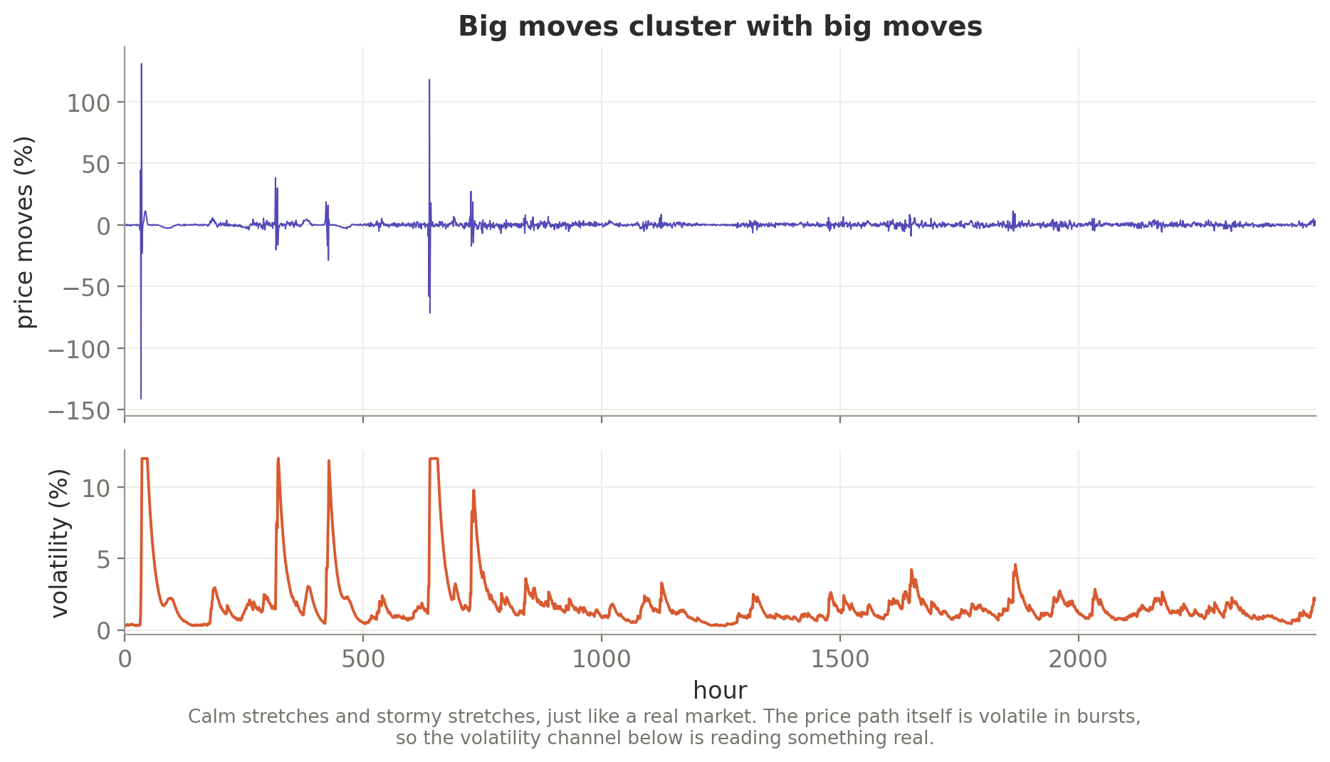
The fix was to make the price path itself genuinely volatile in bursts, using the standard finance model where calm and storm cluster together (it is called GARCH), so the moves really do bunch up and the volatility channel is finally reading something real. The lesson generalizes well beyond finance: if you generate a side channel that claims a property, the thing it is measuring has to actually have it.
Mix It In, Do Not Go Pure
Here is the result that reorganized how I think about all of it.
We ran a deliberately clean experiment. We trained a small model first on a generic baseline of synthetic data, then, on an identical budget, on the same baseline with our event-driven data mixed in.
Crucially, we tested both on a third generator we had never trained on, built with different rules, so we were measuring whether the lessons actually carry over rather than a model recognizing its own handwriting.

The mix won by a real margin on exactly the event-driven cases we cared about. Training on our data alone actually lost, coming in worse than the plain baseline, and the pattern held across the three blends: zero percent and a hundred percent both trailed the fifty-fifty mix.
Synthetic data is an ingredient, not the entire soup. The moment you push the mixture toward pure, the model starts memorizing your generator’s habits instead of learning the world’s. That’s where univariate forecasting deviates from covariate aware forecasting as well, Something that we’re pretty deep in on the model side of things right now.
Keep The Model Out Of The Hot Path
There is a real and useful place for a LLM (as a director) in all of this, but it is upfront and offline. You use it to design plausible scenarios and the grammar of what tends to happen together, once, rather than for every single sample. One of the original things I did with this data generation was have an LLM. Truly steering everything. It didn’t work well.
The reason comes back to arithmetic.
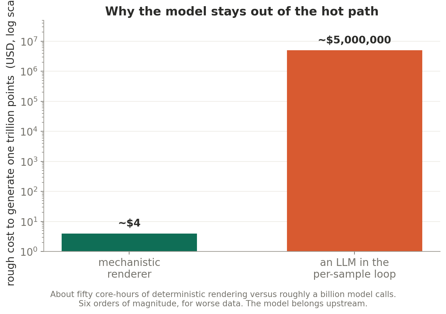
The mechanical generator runs at a few million points per second on a single processor, and every series is fully determined by a single number, its index. You store the index instead of the data and regenerate the series on demand, so a trillion points works out to something like fifty core-hours and is perfectly reproducible from that one number.
Put a language model in that inner loop and you have traded a cheap, instant renderer for an enormous inference bill, in exchange for worse data. That is the whole reason the model stays upfront and never touches the rendering itself.
The Next Step Is Closing The Loop
There is one idea worth borrowing from the language side, and it happens to be the obvious next step here.
The self-improving generators put the usefulness signal directly inside the loop. They set a weaker model against a stronger one, steer the generator toward examples that are just hard enough to learn from, and let the result rewrite the recipe.
Right now, we’re still measuring usefulness after the fact, in that head-to-head test. The generator does not yet know whether the thing it just made will actually help.
So the obvious next step is to close that gap. Generate the data, check whether mixing it in genuinely improves a real forecaster, and let that answer steer how often events fire, how tightly the channels couple, and how hard the cases get. We have the early workings of this loop, albeit in a slightly more involved (did anybody say learning?) deployment.
It is the same weak v strong idea, translated out of language and into time series, and it is where this goes next.
What Holds Up, And What Does Not
If the goal is genuinely intelligent control of complex systems, the binding constraint was never the model architecture but having seen enough of the world, including the rare parts that matter most.
Then doing that in a way that could feasibly occur in a real system and then turning the knob to a trillion and generating a massive a massive amount of this data.
Generating that world, plausibly and cheaply and at scale, is the unglamorous work that the impressive models rest on. It’s the same as language. Physical modeling, control modeling, the list goes on.
If I had to compress the whole thing into a sentence, it would be that the target was never realistic synthetic data. It was synthetic data that measurably improves a decision under the rare, coupled, high-value events that actually matter, rendered by something fast and deterministic and physically constrained, with the model kept upfront where it belongs.
